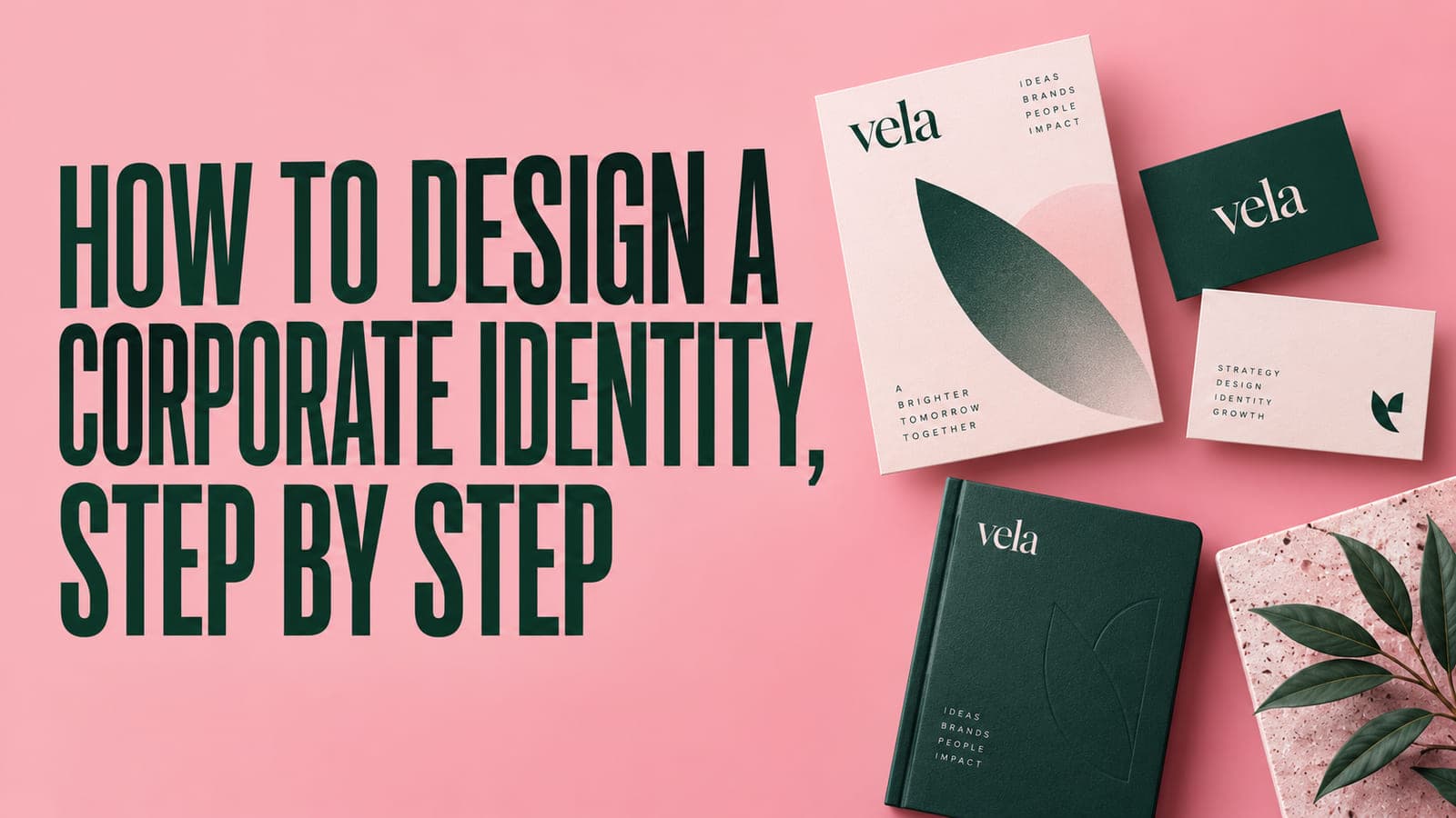
How to Design a Corporate Identity, Step by Step
Ask ten companies what their corporate identity is and nine of them will show you a logo. It's a bit like being asked about your personality and handing over a photograph of your face.
The logo is the smallest part of it. An identity is the set of rules that makes every future decision easier. What the typography does. How much space things get. Which colour means act now and which means read this later. How the brand moves, how it writes, what it sounds like when it has bad news. Get those rules right and the logo very nearly designs itself. Get them wrong and no logo is going to rescue you.
Here's the process, start to finish, the way we work through it.
What a corporate identity actually contains
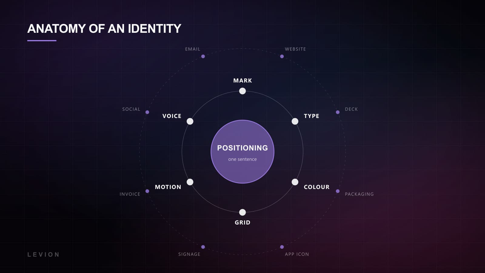
- Positioning. What the brand is, who it's for, and what it refuses to be.
- The mark and its lockups, including the version that has to work at 32 pixels and the one that goes on a building.
- A type system. Two faces at most, with a scale and rules for when each one gets used.
- Colour with roles rather than just hex values. Which is the accent, which is the background, which two never touch.
- Grid, spacing and radii. The invisible layer that makes everything feel like it belongs to the same company.
- Imagery direction, motion principles, and a voice guide with real examples of good and bad. Not adjectives. Examples.
Step 1: the positioning workshop nobody wants to pay for
Half a day, usually with three or four people who can genuinely decide things rather than take it back to someone who can. It's the highest-leverage part of the entire project and it's the line item clients most often try to cut, which tells you something about how invisible good positioning looks from the outside.
What we're after is one sentence the whole company agrees on. Not a mission statement, because those are written by committee specifically to avoid offending anyone, and the result reliably says nothing. Three questions do most of the work: what should someone feel in the first five seconds, what would this brand never do, and who is it pointedly not for. That last one is where it gets uncomfortable. Every founder wants to answer everyone, and every brand that answers everyone ends up looking like nothing in particular.
If your positioning doesn't exclude anybody, it isn't positioning. It's a description.
For CO4 Workspaces the sentence landed on being the calm, focused alternative to working from home. Not the cheapest desk. Not the trendiest. Everything downstream fell out of that one decision: warm neutrals rather than startup neon, quiet type, testimonials from people who just wanted somewhere to concentrate. Brand and site went live in the same week, and tour requests rose 38%.
Step 2: territories, not logo options
We don't present three logos. Presenting three logos invites a committee to pick a favourite, and that's how brands end up designed by taste instead of by strategy. It also guarantees the feedback you get is about the thing you're least able to defend on rational grounds.
So we show two or three visual territories instead. A full page each of what the brand could feel like: type, colour, imagery, layout, a sample headline, a sample interface. The conversation changes shape almost immediately. It stops being I prefer the blue one and becomes this one feels like us, that one feels like our competitor. Better conversation, better decision, and noticeably fewer rounds, which is the part that saves everybody money.
Step 3: build the system, not the artefacts
Once a territory is chosen the real work is defining relationships. A type scale with actual ratios instead of sizes somebody liked. Colour with named roles so a developer never has to guess which blue was meant. Spacing on a consistent step, so nothing ends up on an odd number because it looked right that afternoon. Motion with one easing curve and two durations, used everywhere without exception.
We build all of it as design tokens from the start, which means the identity reaches code without anything being lost in translation. It's also how a brand survives its first real stretch: a new product, a second market, a team that arrived long after the original conversations had finished. Design systems are the industrial-scale version of the same idea, and if there's a product interface involved they stop being optional fairly quickly.
Step 4: stress-test it where it hurts
Every identity looks good on a moodboard. That's what a moodboard is for. The actual test is the ugly applications, and we do those deliberately and early, before anything gets signed off and while changing it is still cheap.
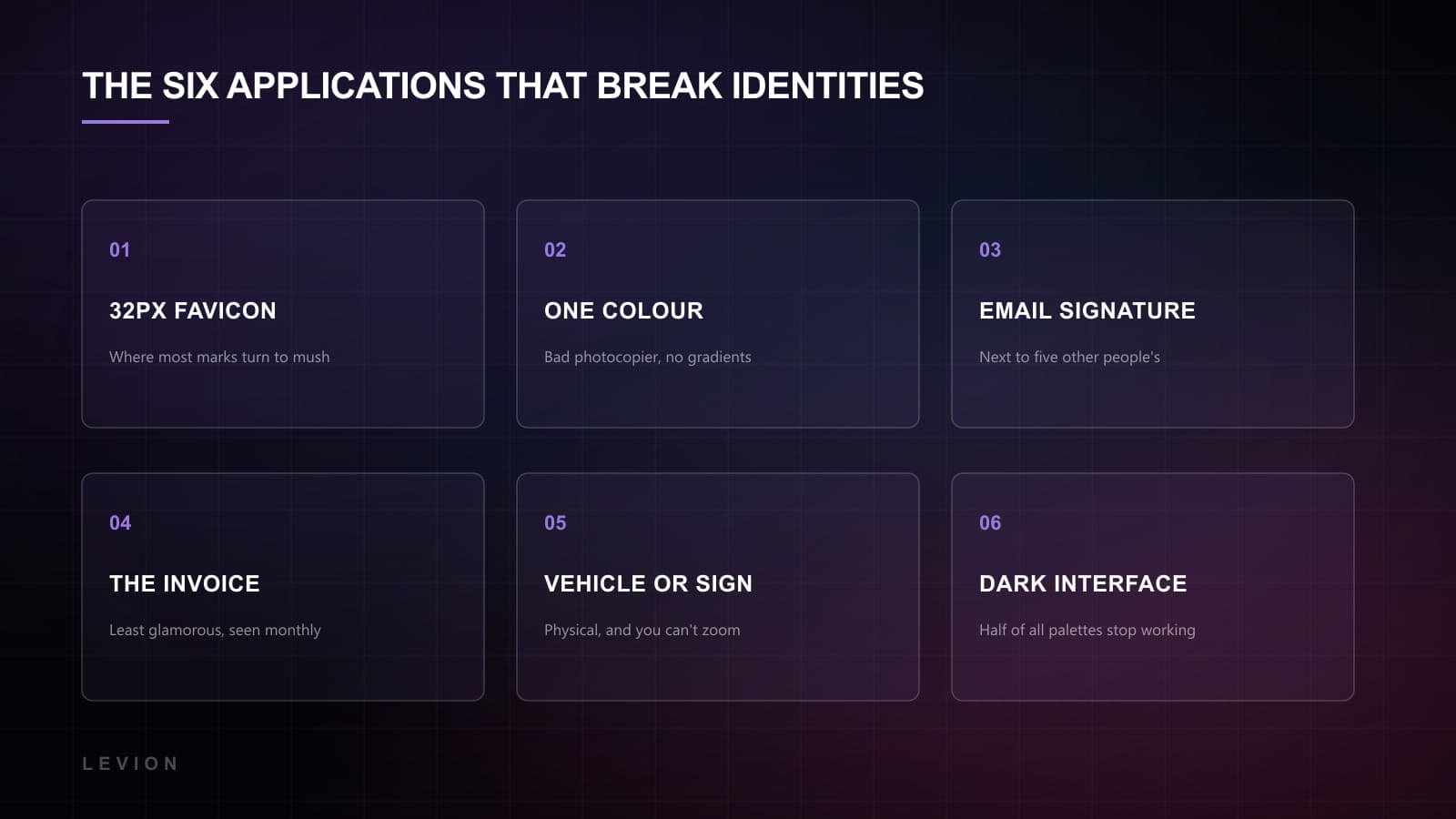
- 01The 32-pixel favicon. Most marks turn to mush here, and you find out in about four seconds.
- 02One colour, on a bad photocopier. Does it still read? A surprising number don't.
- 03An email signature, sitting next to five other people's.
- 04An invoice. Genuinely. It's the least glamorous touchpoint you own and the one a client looks at every single month.
- 05Something physical. A vehicle, a shirt, a sign. Anywhere you can't zoom in and nothing is backlit.
- 06A dark interface. Half the colour palettes we inherit simply stop working the moment the background goes dark.
When we built the brand and site for Integrity 1st Auto Care, the whole promise was pricing transparency. So the test wasn't the homepage, which almost nobody was going to study. It was the quote screen and the printed estimate the customer takes home. Get those two right and the rest follows behind them. Quote requests came out 44% higher.
Step 5: document it so it survives without you
A 90-page PDF sitting in a shared drive is not documentation. It's a souvenir of a project ending. What people actually use is short, specific, and lives where the work happens: a Figma library with published components, tokens in the repo, and a written guide of about five pages covering the things a PDF can't. Tone. Do's and don'ts. What to do when you hit something the guide doesn't cover, which will happen in week two.
The real measure of a good identity has nothing to do with the launch. It's whether somebody who joined last month can make a passable social post in eighteen months' time without needing to ask anyone.
Three mistakes that cost the most
We see the same three failures over and over. They're all expensive for the same reason: they surface about a year in, when the brand is already everywhere, and fixing one of them means touching all of it.
- 01Designing for the pitch rather than for Tuesday. Identities that look extraordinary in a presentation and quietly fall apart in a spreadsheet, a support email, a job ad. The presentation happens once. Tuesday happens every week for years.
- 02Too many colours. Five accents means nobody knows which one is supposed to mean anything, so none of them do. One accent used sparingly will look more expensive than five used enthusiastically, every time, without fail.
- 03No rule for the edge cases. What happens when a headline runs to four lines? When a product name has to sit beside a partner's logo? When there's a photograph and it fights with everything you've built? An identity that only works in ideal conditions isn't finished. It's a moodboard with a logo on it.
When you can't start over
Most of the work we do doesn't begin on a blank page. There's an existing logo somebody is attached to, a colour the founder picked in 2019 for reasons nobody remembers, twelve years of printed material in a cupboard. Full rebrands are rarer than agencies like to pretend, and they're frequently the wrong call: throwing away recognition you've already paid for is a genuine cost, even when the design looks dated to you.
The move in that situation is to leave the mark alone and fix everything around it. Nine times out of ten the logo isn't the problem at all. The type is inconsistent, the spacing is arbitrary, there are four blues in circulation, and nothing anywhere has a rule attached to it. Build the system underneath an existing mark and the company can look completely transformed without a single customer wondering whether they've landed in the right place.
It also costs a fraction of the alternative, and it buys you the one thing a rebrand can't: evidence. Live with the new system for six months. See where it strains. If the mark genuinely turns out to be the weak point by then, you'll be redrawing it with a year of real use behind the decision instead of a hunch and a bad mood.
How long it takes, and how you know it's right
Positioning and territories, two to three weeks. System build, three to four. Applications and documentation, another two. Call it eight weeks for a corporate identity done properly, and longer if there's a product interface in scope, because interfaces have far more states than anyone remembers when they're scoping.
You'll know it's working when decisions start getting faster. When somebody asks what colour the button should be and nobody has to convene about it. When a new page looks right on the first attempt instead of the fourth. That's the entire return on this work, and it's why it's hard to sell: it isn't the reveal, it's the thousand small decisions that quietly stop being arguments.
A word on budget, since nobody publishes numbers and everybody wants them. At the low end you are buying a mark and a colour palette. That's fine for a side project and it will not survive the company growing. In the middle you get a real system: type scale, colour roles, spacing, components, documented well enough that a developer never has to guess. At the top you add research, naming, the product interface and the full application set, which is where the eight-week timeline comes from.
The mistake isn't buying the cheap one. Plenty of companies should buy the cheap one. The mistake is buying the cheap one and then expecting it to behave like the expensive one, and blaming the design when the fourth product launch has nowhere to live inside the system.
If you're weighing up whether to start, this is how we approach brand and design. And if you already have an identity that isn't holding together, that's very often a systems problem rather than a logo problem, which is considerably cheaper to fix than most people assume when they call.