
Design System Agency
We build token-based, documented design systems in Figma and code — one source of truth for design and engineering that keeps your product consistent and fast to build as it scales.
A design system is what stops a growing product from drifting. Without one, every new screen re-invents spacing, colour and components, and the brand quietly falls apart. With one, design and engineering share the same tokens and components, so teams ship faster and everything stays coherent.
As a design system agency we build the system as infrastructure, not a style guide that rots in a drawer. Tokens for colour, type, spacing and motion; a component library in Figma that maps one-to-one to code; and documentation that makes the right choice the easy choice. We work with your design and engineering teams so the system is adopted, not ignored.
The outcome is leverage: new features assembled from trusted parts, a brand that gets stronger as it grows, and a team that can extend the system without us. We can build it from scratch, or audit and consolidate the tangle you already have.
How we work
Audit
We inventory your existing screens and components, find the duplication and inconsistencies, and agree the principles the system will enforce.
Tokens & foundations
Colour, type, spacing, elevation and motion defined as tokens — the single source of truth shared by Figma and code.
Components
A documented component library in Figma that maps one-to-one to production code, with states, variants and usage rules.
Adoption
Documentation, guidelines and hands-on support so your team adopts and extends the system without us.
What's included
- Design token set (colour, type, spacing, motion)
- Figma component library with variants and states
- Code components mapped one-to-one to design
- Usage guidelines and documentation
- Accessibility rules baked into components
- Contribution model so the system keeps growing
- Audit and consolidation of existing UI
- Team onboarding and handover
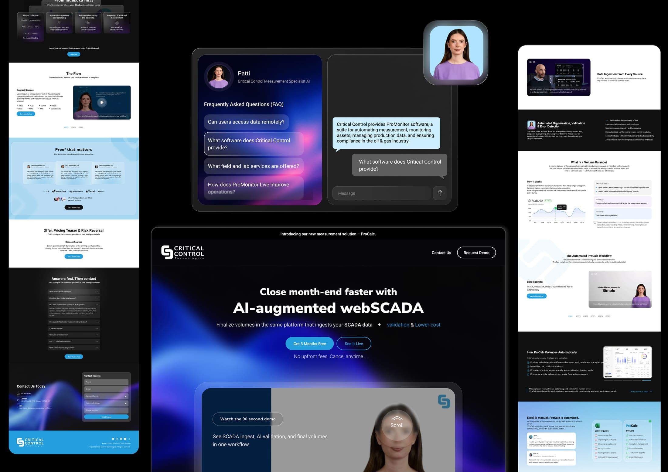
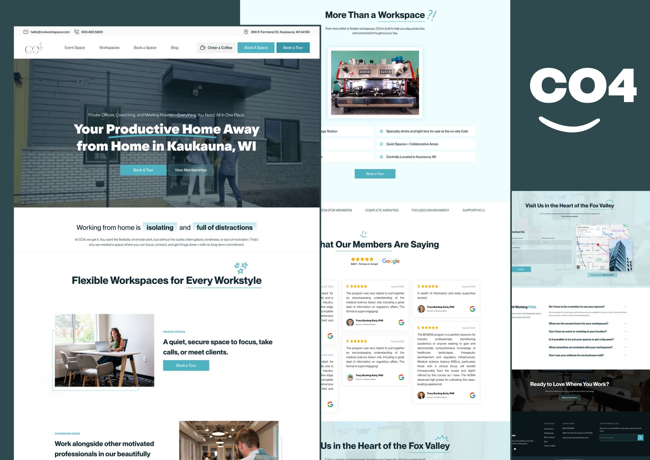
Selected work
Investment
Cost depends on the size of your product and whether we build from scratch or consolidate what exists. We scope after a discovery call and send a clear, phased proposal. Common shapes:
Tokens, core components and documentation for a focused product or a brand launching its first system.
A complete component library across many surfaces, mapped to code, with contribution and governance.
Untangle and unify an existing, drifting UI into one coherent, documented system.
Custom quote after discovery, in writing, phased. Built with your team so it's adopted, documented so you own it.
FAQ
- Design system or just a UI kit?
- A system: tokens, components, rules and documentation that design and engineering share — not just a set of screens. That's what keeps things consistent as you scale.
- Do you deliver it in code as well as Figma?
- Yes. The Figma library maps one-to-one to production code components, so there's a single source of truth rather than a design file that drifts from the build.
- Can you work with our existing components?
- Yes. We often audit and consolidate an existing UI rather than starting over — keeping what works and unifying the rest.
- How do you make sure the team actually uses it?
- Adoption is part of the work: clear documentation, guidelines, a contribution model and hands-on onboarding so the system is the path of least resistance.
- How does this relate to your design and development services?
- It's the connective tissue. We can build the system, then design and build product on top of it (see Design and Web Development).