Conversion-Focused Web Design: What Actually Moves the Number
Conversion-focused web design has an image problem. Say the phrase out loud and people picture orange buttons, countdown timers, and a popup asking whether you're sure you want to leave. That isn't conversion design. It's coercion design, and it stops working the second a visitor notices what you're doing to them.
The real thing is much quieter. It's mostly about removing reasons to hesitate, which turns out to be a design problem, a copy problem and an engineering problem all wearing the same coat. That's also why it so often falls between teams: nobody owns all three.
The button colour thing
Let's get this out of the way first. Yes, contrast on the primary action matters. No, it is not where your conversion rate is hiding. We have never once found a site where the CTA colour was the binding constraint, and we have genuinely looked for it.
What binds is further upstream. The visitor doesn't understand what you do. Or they understand and don't believe you can do it. Or they believe you and can't find the price. Or they've found everything and can't face filling in eleven fields to continue. Fix those four in that order and the button can be beige.
Nobody abandons a form because the button was the wrong red. They abandon because you asked for their company size before telling them what it costs.
The five-second test, done properly
Show somebody the top of your page for five seconds, take it away, then ask three questions. What does this company do. Who is it for. What does it want me to do next. If they can't answer all three, nothing else on the page matters yet, and no amount of polish downstream will rescue it.
It's a brutal test and most sites fail it, usually for the same reason: the hero headline describes an aspiration instead of a service. Unlocking your digital potential tells a visitor precisely nothing. Next.js websites for B2B teams in Madrid tells them everything they need. It's considerably less fun to write, which is more or less why it works.
Anatomy of a page that converts
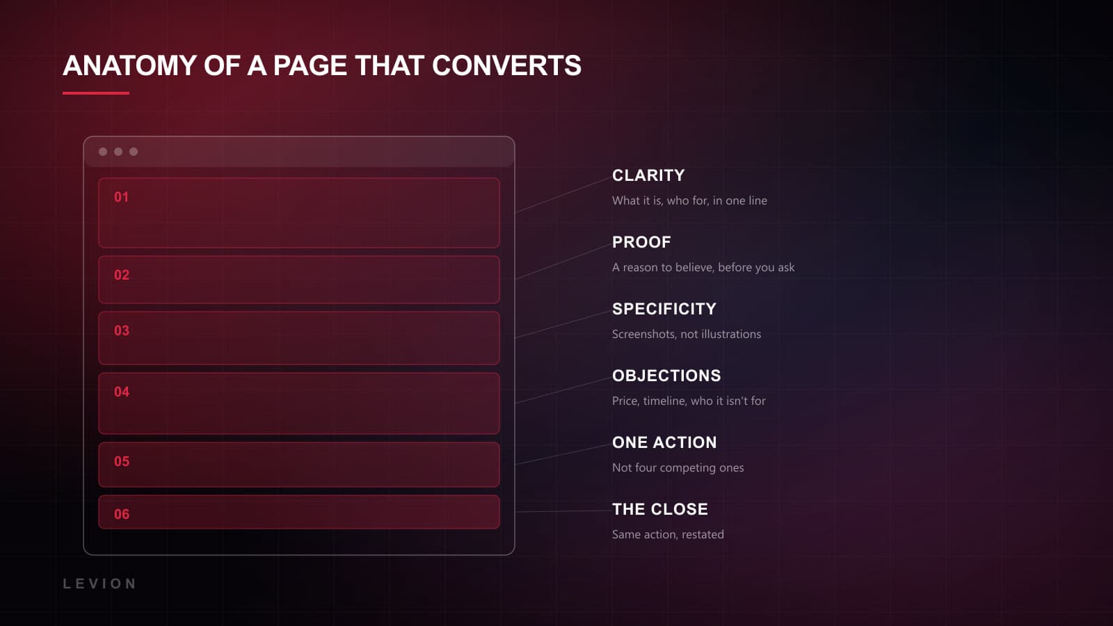
- 01Clarity. What it is and who it's for, in one line. Not a slogan. A sentence a stranger could repeat back to you accurately.
- 02Proof, immediately. Logos, a number, a real quote from a real named person. Before you ask for anything, give a reason to believe you.
- 03Specificity. Screenshots rather than illustrations. Actual deliverables rather than bespoke solutions. The specific outsells the general every single time.
- 04Objections, handled on the page. Price, timeline, who it isn't for. Every unanswered objection becomes a reason to close the tab and think about it, and almost nobody comes back from thinking about it.
- 05One action. Not four. A page carrying a book a call, a download the guide, a newsletter box and a chat bubble is a page with no action at all on it.
- 06The close, repeated. Same action, restated at the bottom for the people who actually read the whole thing.
The four leaks
Across the last few years of client work the same four leaks account for most of the lost conversions. Roughly in order of what they cost you.
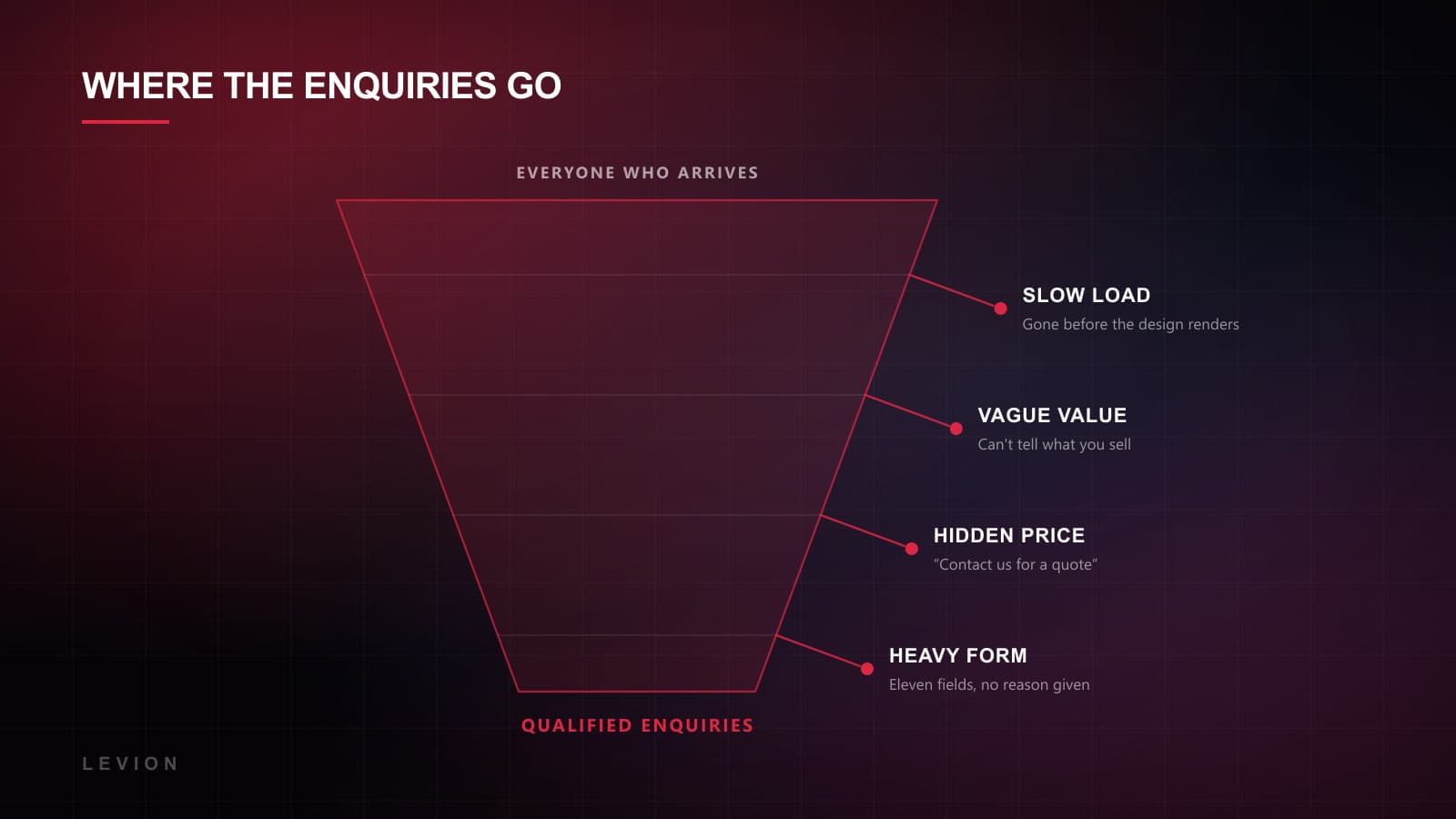
- Speed. A hero taking four seconds over 4G has already lost a chunk of your mobile traffic before the design is even visible. This leak is invisible in analytics, because the people who left never registered as a session anybody counted.
- Vagueness. If the visitor can't work out what you sell, every bit of effort downstream of that is wasted.
- Hidden price. Contact us for a quote filters out the people who would have paid alongside the ones who wouldn't. A range, a starting-from, even an honest projects typically run €15–40k, all convert better than silence.
- Form weight. Every field costs you something. Ask for what you need to have the first conversation and stop there. Company size can wait until you're talking.
What this looked like on real projects
For Integrity 1st Auto Care, an auto shop, the whole redesign was built on the one thing that industry reliably hides: pricing. Upfront quotes, transparent costs, booking in a single tap. Quote requests went up 44%, and the button, for the record, stayed the same red it had always been.
For the Complete Strength Training Guide, a single-page product sale, the leverage was sequence. Pain points, then proof, then the FAQ, then one decisive action. No navigation and nowhere to wander off to. Conversion rate up 44%.
For CO4 Workspaces it came down to framing. Coworking is normally sold on price and desks. We sold it on focus, with member testimonials doing the persuading instead of us. Tour requests up 38%.
Three projects, three completely different levers, and not one of them a colour.
Copy is the highest-leverage design tool you have
Designers don't especially enjoy hearing this, and we are designers. But on a page whose job is to convert, the words do most of the work and the layout mostly gets out of their way. You can spend three weeks on a hero animation or an afternoon on the headline. The afternoon wins, and it isn't close.
The pattern that works is boringly consistent. Say the specific thing. Not transform your workflow but cut invoice approval from six days to one. Not trusted by industry leaders but the four logos and the number. Specificity reads as competence, because only somebody who has actually done the work knows the details well enough to quote them.
- Write the button label as the outcome, not the mechanism. Get my quote beats Submit. It's a tiny change and it's free.
- Put the objection in your own words before the visitor gets there. Yes, this costs more than a template, and here's why that's the point. Naming it defuses it.
- Cut the first paragraph. Almost every page has a warm-up sentence before it says anything real. Delete it and the page gets sharper, every time, without exception.
- Read it out loud. If you'd be embarrassed saying it to a client's face, it doesn't belong on the page.
Mobile is the actual test
Somewhere between half and three-quarters of the people deciding whether to contact you are doing it on a phone. Often one-handed. Often while doing something else entirely. And most sites are still designed on a 27-inch monitor and checked on mobile right at the end, which is precisely backwards.
What breaks on mobile usually isn't the layout. Responsive grids solved that a decade ago. It's the sequence. A desktop page can afford a hero, then three columns of supporting detail, then proof. Stack those vertically and your visitor scrolls through six screens of supporting detail before reaching a single reason to believe you. The proof has to move up the page.
The other mobile killer is form fields. Every field costs roughly twice as much on a phone as on a desktop, because typing is worse and the keyboard covers half the screen while you do it. If your form has a how did you hear about us dropdown, it is costing you enquiries in order to answer a question you could just ask on the call.
Design the mobile version first and the desktop one becomes easy. Do it the other way round and mobile becomes a compromise you apologise for.
Testing without fooling yourself
Two things worth saying here, because this is where good intentions reliably go to die.
First, most sites simply don't have the traffic for an honest A/B test. If you get 800 visits a month, a test needs several months to reach significance, and by then you'll have changed four other things and the result means nothing. Below roughly 1,000 conversions a month, use judgement, qualitative feedback and session recordings, and be honest with yourself that judgement is what you're using.
Second, watch what happens after the conversion. A form that doubles its submissions by dropping the qualifying questions hasn't helped anybody if half the new leads are wrong-fit and your sales team now spends its week saying no. We track qualified enquiries rather than raw form fills, because the raw number is the easiest one to game and the least useful one to own.
Any metric you can improve by lowering your standards isn't a metric. It's a mirror.
Where to start on Monday
Run the five-second test on your own homepage, with somebody from outside the company. Then check your load time on a real phone rather than a desktop simulation. Then count the fields on your main form and delete the ones you don't need for a first conversation. That's most of it.
Then do the same for the page nobody ever designs: the one people land on after they convert. A thank-you screen reading we'll be in touch wastes the single highest-attention moment you will ever get from that person. Tell them exactly what happens next, who will contact them, and when. Give them something to read while they wait. It costs nothing and it measurably reduces how many of them go and enquire with two competitors in the meantime.
The same logic applies to the automated email that follows it. Most of those were written once, by whoever set the form up, and never looked at again since. Go and read yours. It's part of the design whether you treat it that way or not.
That's a morning's work and it will tell you more than a month of heatmaps will. If the answer turns out to be structural, conversion-focused design is how we build. And if you're not sure whether that means a full rebuild or something smaller, we wrote about how to tell.